Hey Guys,
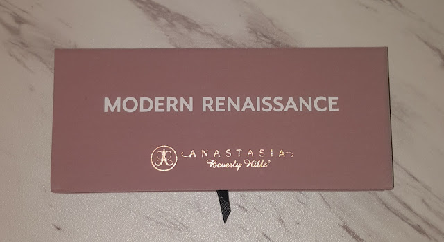
I have had this review started for quite some time now but it got pushed off because of the holidays. Today I am FINALLY going to share my thoughts with you on the Anastasia Beverly Hills Modern Renaissance palette! My friend Kim (A Very Sweet Blog) sent me this palette as well as the Master by Mario as a gift a few months back. I have been testing out both for quite some time. Keep reading to hear my thoughts!
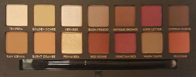
This palette has been in and out of stock for some time now but its currently in stock at Ulta! It contains 14 shades and is a mix of matte/shimmer and neutral/berry tones.
Here are the shadows with the flash:
Here are the shadows without the flash:
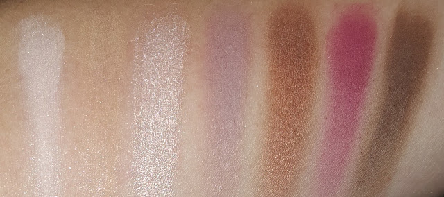
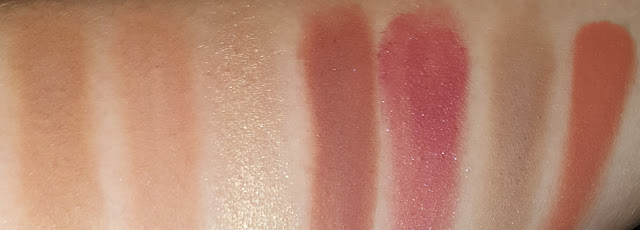
Below are swatches of the top and bottom rows:
L-R- Tempera (velvety beige w/ an ultra-matte finish)
- Golden Ochre (earthy yellow w/ an ultra-matte finish)
- Vermeer (iridescent shell w/ a metallic finish)
- Buon Fresco (antique lavender w/ an ultra- matte finish)
- Antique Bronze (metallic sable w/ a satin finish)
- Love Letter (raspberry w/ an ultra-matte finish)
- Cyprus Umber (dark coffee w/ an ultra-matte finish)
L-R:
- Raw Sienna (neutral amber w/ an ultra-matte finish)
- Burnt Orange (deep orange w/ an ultra-matte finish)
- Primavera (shimmery gold dust w/ an ultra-matte finish)
- Red Ochre (sienna w/ an ultra-matte finish)
- Venetian Red (crimson w/ an ultra-matte finish)
- Warm Taupe (earthy gray w/ an ultra-matte finish)
- Realgar (brick w/ an ultra-matte finish)
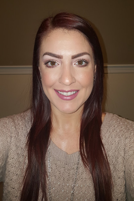
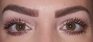
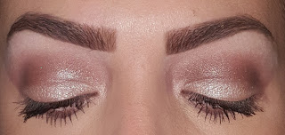
Below are two looks that I created using this palette:
Brow: Tempera
Transition: Buon Fresco
Crease: Antique Bronze
Lid: Vermeer
Lower Lash Line: Buon Fresco & Antique Bronze
Inner Corners: Vermeer
Brow: Tempera
Crease: Raw Sienna
Lid: Primavera & Vermeer
Lower Lash Line: Raw Sienna
Inner Corners: Primavera & Vermeer
On to my thoughts:
In all honesty, when I originally saw this palette, I wasn't drawn to it. I don't wear berry/pinks often so I didn't think I would find use of this palette. Thankfully, Kim seems to know me better than I know myself because I LOVE this palette! I have reached for this more than the Master By Mario which comes as a complete shock to me. These shadows are on part with other ABH palettes that I have tried. They are creamy, super pigmented, and blend beautifully. There are plenty of neutrals in this palette and I actually really like the purplish look that I created above. I have used the Red Ochre in a look and was quite pleased with the outcome. The only two colors that I haven't used are Venetian Red and Love Letter. I know I will eventually venture over to those colors and try to create a look incorporating the more purple shades as well. This is a beautiful and well rounded palette. For people like me were are afraid to go out of their comfort zone, this is a great way to experiment with a little color that you are not used to. I am so glad that Kim picked this out for me and highly recommend it! Thank you Kim! <3
Have you tried this palette? What are your thoughts on the color scheme? Post your comments below!
*This list contains some affiliate links which I could be compensated for.




No comments:
Post a Comment